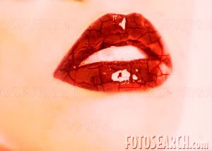
Dry lip, please... give it some water . It needs water like needs a kiss
Sunday, March 29, 2009
Subjcet : da da
Sunday, March 22, 2009
Friend or Foe poster, Tomoko Miho

Friend or Foe poster for the National Air and Space Museum, 1976
These is the most famous poster of a series for the Nation Air and Space Museum.
This poster is achievement of both Jim Miho and Tomoko Miho when they are leaders of Miho Inc., The “Friend? Or Foe” poster showed a huge Air Force symbol in the foreground which appeared in World War II (WWII). At the top of poster, these are many styles of fighter planes in WWII. It poster had taken a big question for a long time, air planes are “Friend? Or Foe”, to bring people or to become aircraft .Furthermore, she arranged the planes in short columns at the bottom with continuance style form up to down, nothing a low horizon line leads to one must cut down. The balance is used to deliver the picture with two part by a top of the star. Tomoko use good principle design with continuance style for her picture. In the center of her picture, the audience see the red sun in white star and the star in a blue big circle. The dominance is the position between big logo ins the center and the columms of planes and the words “Friend??” “Or Foe?”
For Tomoko , scale is defined as a question of contrast a relationships and a concern for detail .To make a picture seem majestic , there are short captions setting in small type not large ones . An huge entrance is created by a twelve-foot architectural sign creating by a glass and steel tower . invisible grid congers authority to an uncluttered layout
Alien get fire
Saturday, March 14, 2009
Gestalt
The continuance is for pictures and the Closure for design.
I want to make the link likes a thinking what is next "Hell, Yes!!", that is a lazy clown
Fore Closure, this is the line missing and the 1/4 of circle, I want to let a information for the "Hell,Yes!" for customer when they watch my page. They will get some question before they read " What is the hell???", " Is that the day nobody can smile?". Why they will get that question, because the conect of the pictures anf the design. In the pictures the clown is sleeping, he does not work, the work is for smiling, happiness, funny ....This is a reason for i choose closure, because that is the missing .
My Logo
There are my logo " Minh Minh in Love", i did it with illustrator with Brush. At the first time i draw in paper. With me logo is simple as possible will make real the artist want to share with reviewer
The Heart is like letter M
The red line i s"i": victory, lovely, hot.... this is love make i feeling when i fall in love
The yellow line is "n": yellow because love with me, is shinning, warm... but yellow is the color for the lie. Yes, sometime in love but no more.
The green line is "h": That is "hope", believe in somthing will come true!!!
Now, my love is.... Design
Can you see the hat which is under my heart?? This is a magic hat, opens my love with design!!!!
Subscribe to:
Posts (Atom)